Painting the Taiwan of the Future!!
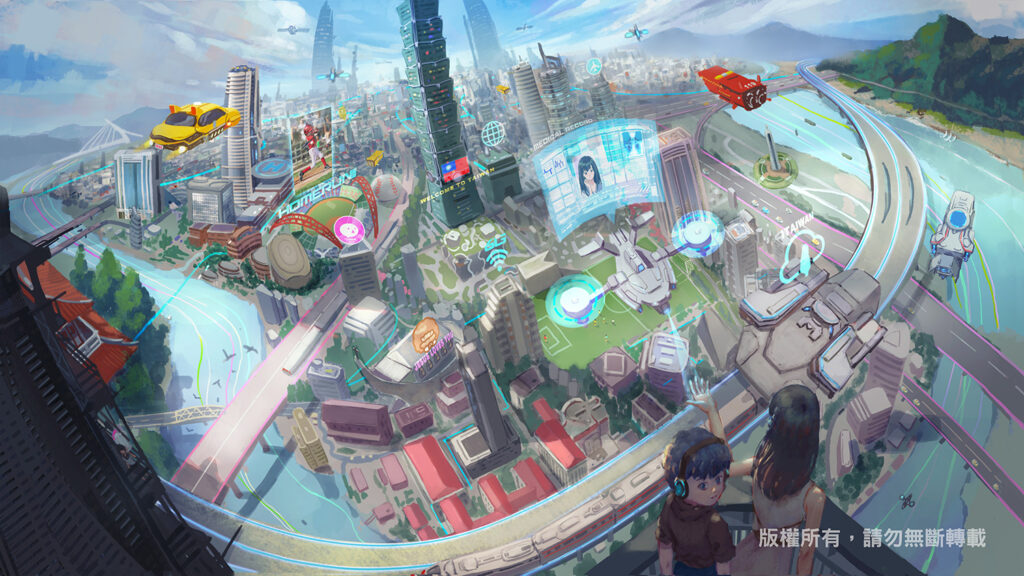
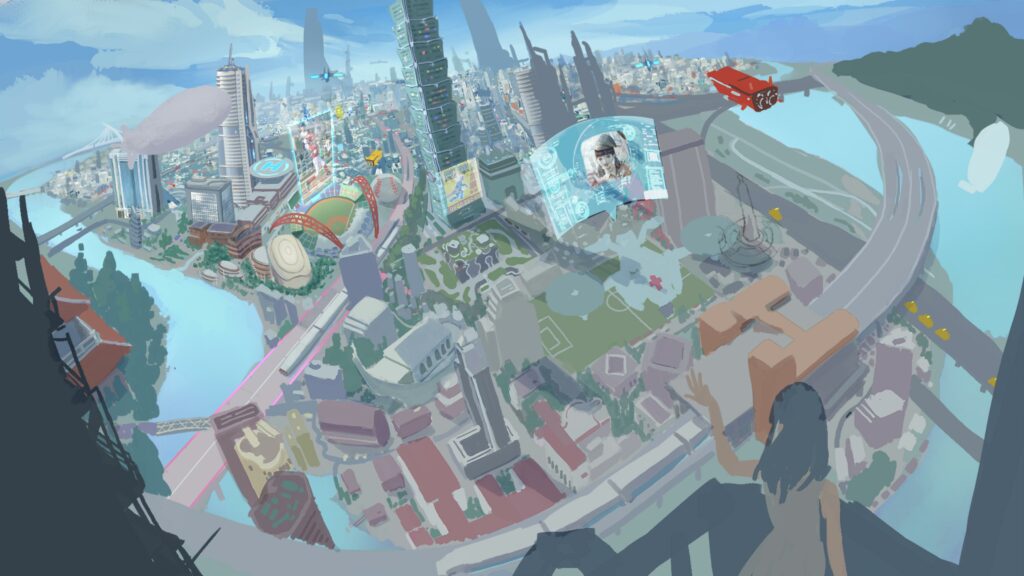
When I learned this commission was to paint the Taiwan of the future, I thought — what a fun project. Below is the finished piece; you can see I put landmarks from all over Taiwan into a single frame. It feels like using Doraemon's teleport map 😂 But distances do keep shrinking as technology advances. I hope the Taiwan of the future really becomes such a convenient place (hopefully 😂)
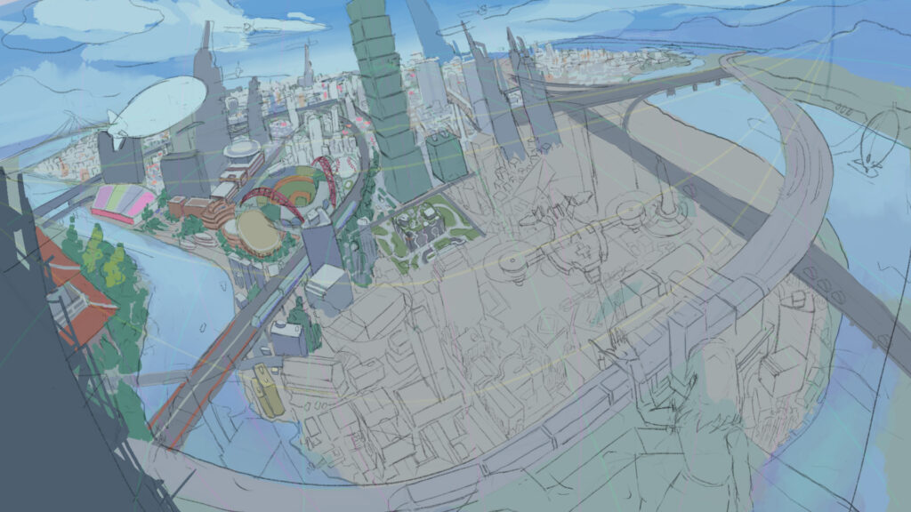
Line Art — Settling the Scene's Perspective and Composition
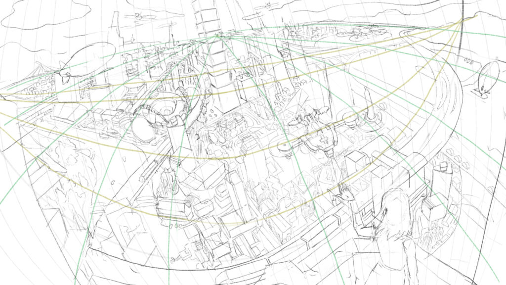
What matters most in a scene? Many would say the sense of space and perspective, and both are indeed crucial. I wanted to squeeze as many Taiwanese landmarks into this image as possible, so for the camera I chose a bird's-eye fisheye lens. That's genuinely hard to draw, so I gathered plenty of photography and painting references with similar viewpoints. If you know 3D software like Blender, using it as an aid makes this kind of production much easier.
Laying the Base Colors
Once the rough line art was settled, I began giving the image its basic color scheme with flat painting. For base colors I used a square brush as my blocking brush, shrinking or even removing the brush's own texture, so the base colors would feel more solid. For cities and architecture this works better — the more solid the strokes, the less ambiguity there is to wrestle with when refining later.
Mixing Real and Implied Detail
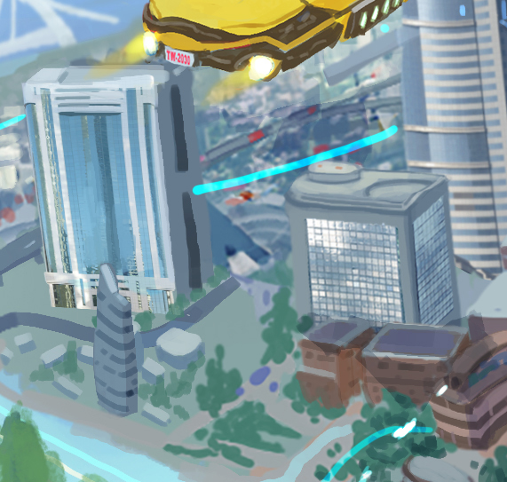
There was plenty to refine in this image, but the more element-heavy a piece is, the more the painter must deliberately blur the non-focal areas. In my case, I use scattered dots and dabs to sweep quickly over things the naked eye couldn't resolve anyway (e.g. the far distance) with small broken strokes. There were still many areas needing precise rendering, but blending in implied detail here and there saves a lot of refinement work — and honestly looks better than polishing every corner.
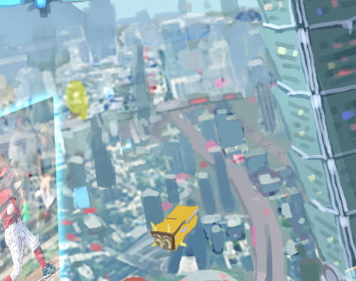
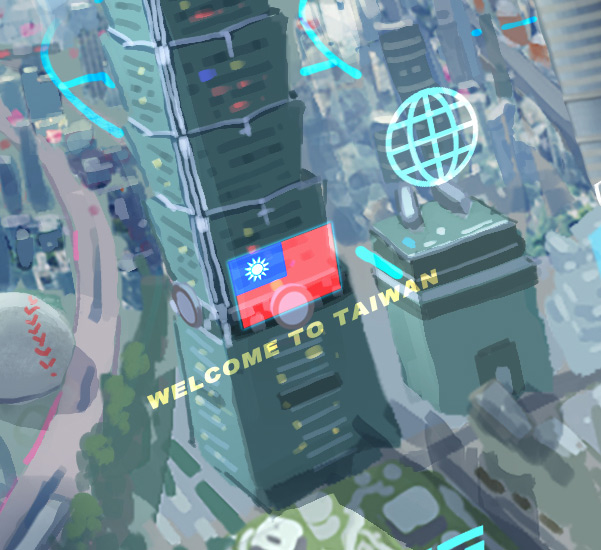
Compositing Signs and Effects
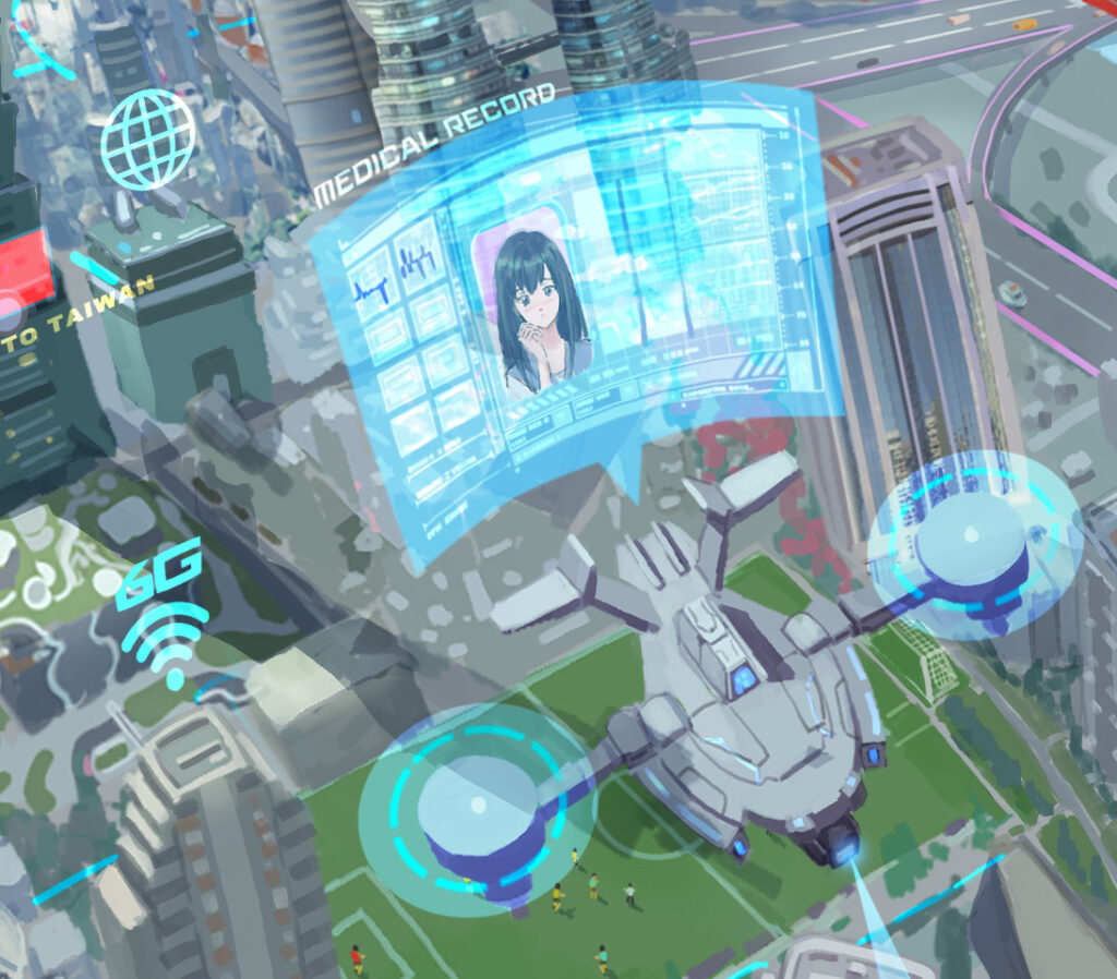
In a future city, effects like holographic projections are essential visual elements, so I picked a few representative logos and UI to composite in. Some I painted myself — for example, the medical consultation interface by the girl in the image: I gathered some Iron Man-style UI reference, made slight adjustments in Adobe Illustrator, and composited it on. After compositing, adjusting the layer blending mode (usually Color Dodge, Screen, Hard Light, or Linear Dodge layers) produces these kinds of effects.
Finished
Finally, after tidying the overall lighting and haze, it was done. I originally hadn't planned to add the little boy looking toward the camera — I added him at the end hoping his gaze would loop the composition's flow back around.
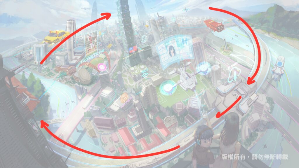
From the walkthrough above you can see that when thinking about background composition, I lean on abstract geometric flow. What a scene must consider is how to carry the audience into the story the painter wants the image to tell — so how you guide the viewer's eye is, to me, the single most important point when painting scenes. If this process share has you interested in learning scene painting, check out our Tibame course "Photoshop Scene Design: Pushing Visual Limits" — it should be a great help to anyone keen on learning scenes! That's it for this scene painting share — see you next time!!