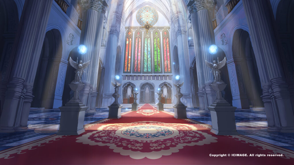
You Finish the Figure, and Then... Right, the Background...

For many artists, handling the background is a frequent challenge when painting figures. Beginners and experienced painters alike can get stuck here. The background is more than a decorative element — it also shapes the whole image's atmosphere, composition, and storytelling. Yet because figure paintings usually center on the character, many creators neglect the background and the overall image loses its balance.
The complexity of background design also confuses many people. Should it be abstract or concrete? Simple color blocks, or more detail? How do you make the background support the character without stealing the spotlight? These questions often leave people at a loss.
This article digs into how to handle backgrounds in figure painting, with practical techniques and advice to help you better understand what a background does — and raise the quality and expressiveness of your work.
How to Handle a Figure Painting's Background
1. The background's role and positioning
First, deciding the background's role is essential. A background can set the mood, guide the viewer's eye, convey the scene's emotion, and even strengthen the story. Remember that a background isn't just filler on the canvas — it should relate to the character rather than exist in isolation.
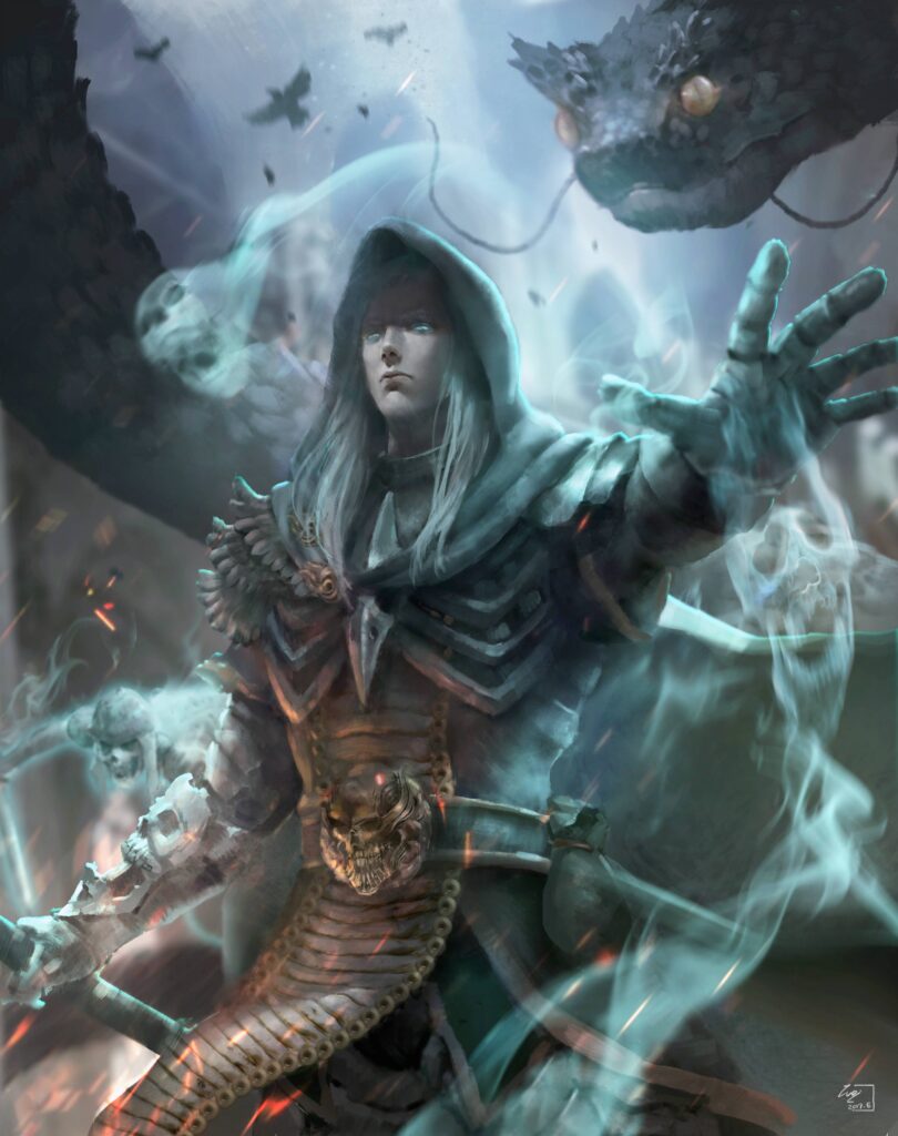
Take the cover I painted for author Peter North as an example. If your character lives in a frigid land, the background might be a cold-toned forest in wind and snow, with mist and snow spraying as the character swings a warhammer, heightening the sense of motion and presence. If you're painting a shaman witch, the background could be a full moon, crows, and a blood-tinged red mist to build a slightly eerie, mysterious mood.


2. Simple doesn't mean boring
Many beginners assume a background must be complex and packed with detail for the image to look complete. In fact, a simple scene can sometimes do the job of guiding the viewer's eye even more powerfully. The right level of complexity depends on the character and the needs of the piece. Minimal backgrounds — a single-color gradient, blurred shapes, or geometric patterns — can direct the focus onto the character without making the image feel flat. So when the figure's pose is already compelling, a simple atmospheric wash in the background can actually work better.

Especially in digital painting, using your software's features to blur or reduce background detail is an effective technique. For example, applying "Gaussian blur" to soften the background helps the foreground figure stand out. Simple lighting shifts or gradient tones can also add depth to the image.
3. Choose the right colors
Color is one of the keys to background design. The background's colors should harmonize not only with the character's clothing and skin tones, but also with the overall emotion and mood of the image. Jarring color choices can disrupt the harmony and distract the viewer. In contrast, well-judged color contrast and a harmonious palette effectively emphasize the subject and can even strengthen the work's visual impact.
For example, a cool-toned background can convey the solemn weight of wartime, while warm-toned fire or explosions in a corner of the frame provide contrast so the image doesn't feel too heavy. The background's colors can also be adjusted to follow changes in the light source, making the whole image more unified and natural.
4. Make good use of layering
A successful scene creates a sense of space and depth. By using depth-of-field techniques to clearly separate foreground, middle ground, and distance, you can present spatial depth on a flat surface. This treatment not only makes the background more interesting, it also emphasizes the character's importance in the frame.
We can create this layering by adjusting tonal contrast, sharpness, and detail. For example, the farther away an object is, the blurrier and lower-contrast it should be, while objects near the foreground should be crisper and more saturated. This lets the viewer's gaze settle naturally on the character while making the whole image feel richer.

5. Lean on references
When you're unsure how to handle a background, references are your best friend. Photos, film stills, and other illustrations can all serve as sources of inspiration. By observing others' work, you can learn how to handle the relationship between background and character effectively — studying their color use, lighting, and composition.
Of course, references are for learning and inspiration, not direct copying. Apply the techniques you observe flexibly, according to your own creative needs, and blend them into your own style and ideas.
6. Experiment with different styles
There is no fixed formula for backgrounds. Different styles and techniques produce completely different results. So when working on backgrounds, don't be afraid to experiment boldly — from realistic scenes to abstract designs, or a mix of both. This not only helps you find the approach that suits you best, but also enriches your creative perspective.
For example, try weaving geometric shapes or patterns into the background to add a sense of design, or use richly textured brushes to create distinctive surface effects that deepen the background.

Final Thoughts

Backgrounds play a key role in figure painting. Whether it's a simple color design or an elaborate scene, the background shapes the whole image's effect and atmosphere. Handling it well takes not just technique, but a clear understanding and plan for the picture as a whole. With sound composition, fitting colors, and clever layering, you can create the perfect background — one that supports the character without upstaging them.
Whether you're a beginner or an experienced illustrator, backgrounds are something you refine through constant practice and exploration. I hope this article offers some useful advice to help you improve the expressiveness and completeness of your work.
One of the topics in our free WeiChen Studio 維真電繪筆記 seminars is "The figure's done — now what about the background?" If you're interested in learning about figure backgrounds, you're welcome to reserve a spot in the free livestream lecture — it should give anyone hoping to improve in these areas a much clearer learning direction!
If you have any questions, feel free to ask in our Discord server!
Tap here to join the WeiChen Studio community Discord