Grayscale Painting — A Way of Splitting Problems Apart
In digital painting, grayscale painting is a powerful technique that helps illustrators quickly establish a character's form and movement while providing a clear light-and-shadow structure. In character design, form and movement are the key elements that decide whether a character feels alive and appealing, and grayscale painting is an ideal, efficient way to achieve them. This article takes a deep look at how to apply grayscale painting, with practical tips for quickly building form and movement in your character designs.
Why choose grayscale painting for character design?
The core advantage of grayscale painting is that it simplifies the creative process, shifting focus from color to lighting and structural form. This lets designers:
- Focus on shape and structure: The first step of character design is shape and silhouette, which create the character's basic visual impact. Grayscale narrows the problem down to the rhythm of light and shadow shapes, without the distraction of color choices.
- Strengthen lighting: Grayscale painting lets you concentrate on the distribution of light and shadow, ensuring the character's sense of volume and weight reads correctly. For a character's movement to convince, precise lighting is indispensable.
- Paint faster: In the early design stage, grayscale painting speeds up the work and reduces hesitation over color choices. It's especially useful when sketches or concepts must be finished in a short time.
The basic steps of grayscale painting
To apply grayscale painting in character design, follow these steps:
1. Initial blocking
Build the basic form
Start with simple geometric shapes (circles, rectangles, triangles) to establish the character's pose and proportions. The goal of this stage is to settle the character's overall gesture, which becomes the foundation for the rest of the design.
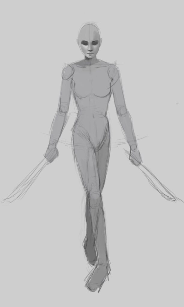
Establish the gesture
Gesture is the soul of character design — it decides whether a character feels alive. With grayscale painting, you can use different gray values to emphasize centers of gravity and turning points, making the character's movement clearer. For example, the connection between the chest and waist, or the bend of an arm, can be picked out with darker grays to highlight these key spots.
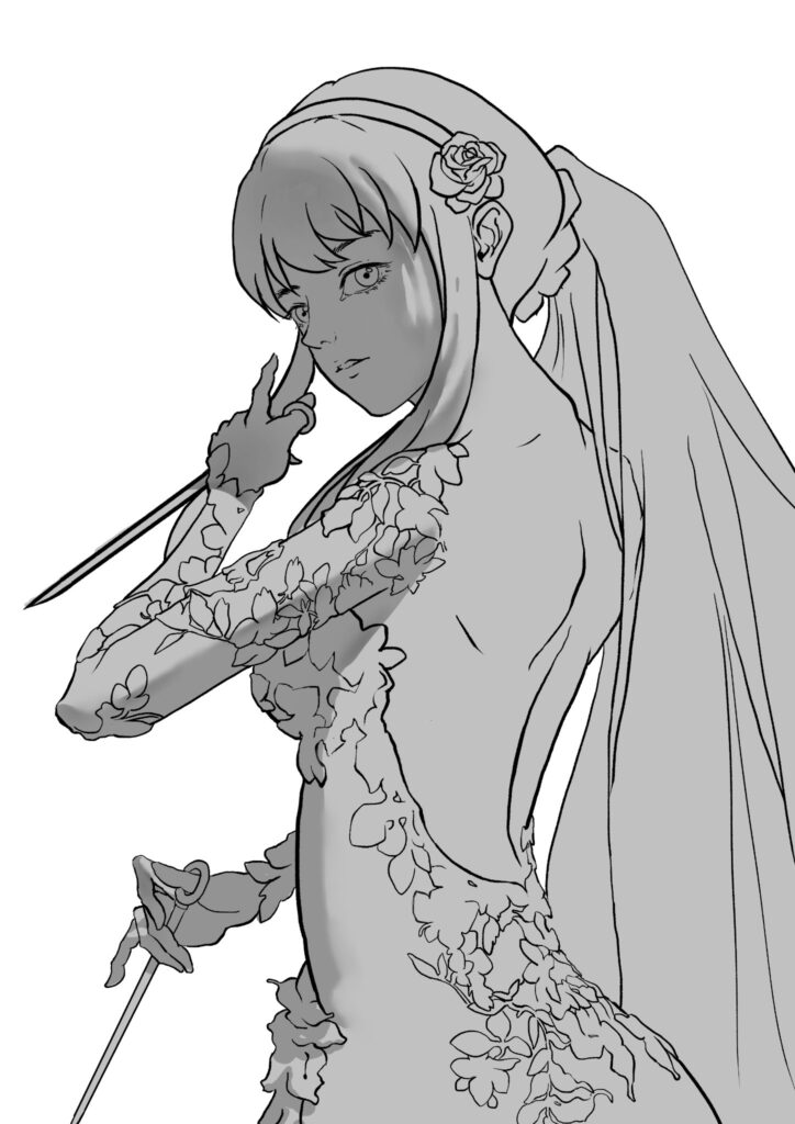
2. Add light and shadow
Decide the light direction
Once the basic form is in place, the next step is placing the light source. Its direction determines where shadows fall, which greatly affects the character's sense of volume. At the design stage, it's common to choose a single main light to simplify the lighting and keep the character's dimensionality clear.
Build shadow layers
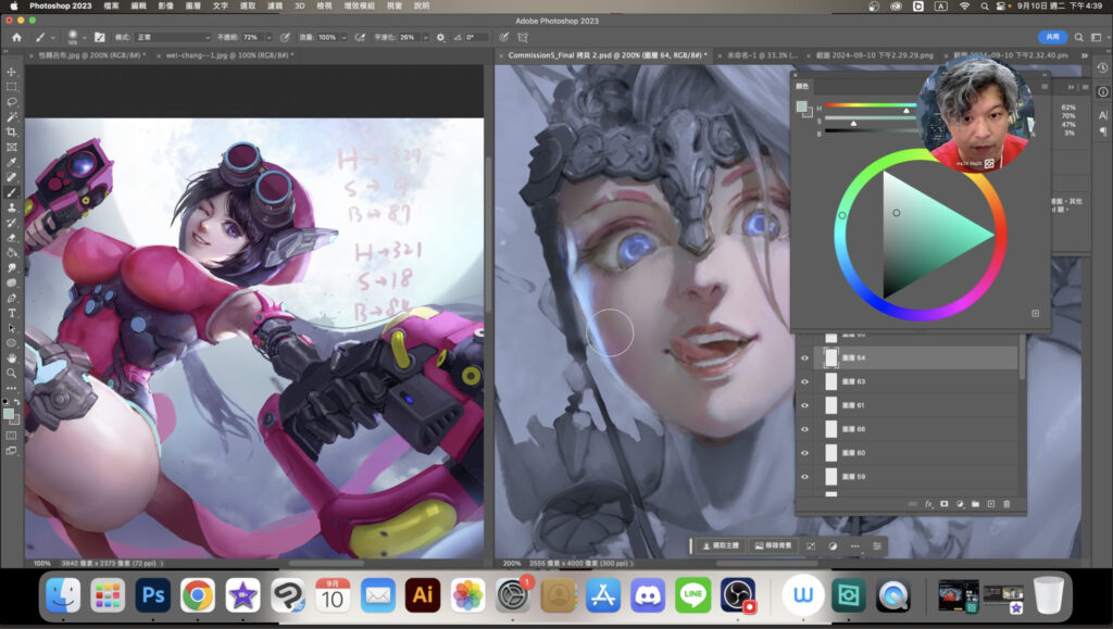
Apply different gray values across the body to simulate lighting and shadow. Focus on soft transitions in the shadows so the character's lighting looks natural. The transition zone between highlight and deep shadow — the middle grays — is often where a character's detail and texture show best.
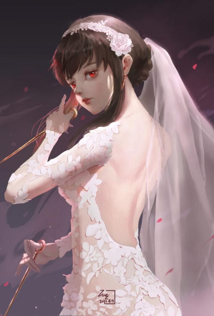
3. Refine movement and form
Emphasize the form's turning points
Grayscale painting lets you focus on where the form turns — knees, elbows, shoulders. The stronger the value contrast at these spots, the more pronounced the sense of movement. Through grayscale contrast you can emphasize the direction of motion and the body's structure, giving the character more tension.
Expressing movement and adjusting the center of gravity
Another key element of dynamic design is the center of gravity, which decides whether a character feels stable and whether it carries a sense of motion. In grayscale, you can tune the feeling of weight with values — for example, when one foot is darker than the other, that foot reads as more planted and load-bearing.
Combining grayscale painting with color design
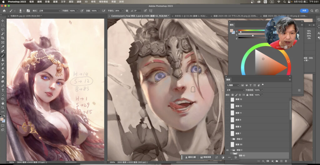
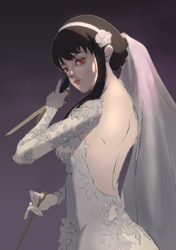
After the grayscale sketch is done, the next step is usually to bring color into the design. That doesn't mean throwing away the grayscale structure. On the contrary, you can layer color directly over the grayscale, keeping the light-and-shadow distribution it established, so color and lighting stay consistent.
There are a few common ways to combine grayscale with color design:
- Color overlay (Color Overlay): a simple, efficient coloring method. Create a new layer over the grayscale, set its blending mode to "Overlay" or "Color," and apply color there. This preserves the grayscale's lighting structure while giving the character color.
- Soften edges and lighting transitions: When applying color, fine-tune with the shadow layers from the grayscale stage so colors transition naturally across materials and light changes.
- Balance color against grayscale contrast: Color shouldn't overpower the contrast in your grayscale structure. Keeping color anchored to the grayscale base preserves overall clarity and balance.
Conclusion
As a foundational tool for character design, grayscale painting helps illustrators focus on structure, movement, and lighting, greatly improving both speed and results. In the early stages of character design, grayscale painting is a highly valuable strategy — especially for quickly establishing form and gesture — and it combines beautifully with color work later on.
If you want to push your character design further, grayscale painting is a tool you can't afford to miss. Whether you're a beginner or a professional illustrator, this method will help you create characters with more movement and dimension.
I hope this article helps you understand how to use grayscale painting to quickly build a character's form and movement.
One of the topics in our free WeiChen Studio 維真電繪筆記 seminars is Understand Grayscale Painting in One Hour. If you're interested in learning grayscale painting, you're welcome to reserve a spot in the free livestream lecture — it should give anyone hoping to improve in these areas a much clearer learning direction!
If you have any questions, feel free to ask in our Discord server!
Tap here to join the WeiChen Studio community Discord